A sort of "manufactured synaesthesia": Lewis Heriz
British artist and designer Lewis Heriz is known for his ravishing album artworks for labels like Sofrito, Soundway, Stones Throw and Now Again. Growing up with records and covers surrounding him, Heriz formed a unique and organic approach to the idea of album covers. We had a chance to talk with Heriz about the bond he creates between the sound and the image.
Interview by Cem Kayıran

When and how was your first encounter with drawing? Has music been always a trigger for your visual art?
Like pretty much everyone, my first encounter with drawing was as a small child with a crayon. It remained a constant but frivolous activity – I’d draw cartoons and odd psychedelic doodles whenever I could – until my mid-20s, when I realised that I was constantly being asked to draw things for friends and acquaintances who were putting on gigs where I was living at the time, in Nottingham. It seemed like I was being told that this is something I should take a bit more seriously. So while music wasn’t really a trigger up until this point, it was the trigger that pushed me into thinking about drawing in a different, far more in-depth way. I found it gave me license to explore diverse aesthetic languages, since the music I was working with then ranged from abstract electronic to folk & roots. It allowed me to legitimately play around with style, and was a springboard to my investigating the emotional effect of colour.
Through the music history, we’ve seen some labels identified with their visual taste or even some specific artists’ esthetics. In that sense, what kind of bond you observe when you think about your own works and the iconic labels you’ve been working with?
A label’s style or aesthetic becomes clear once there is a body of work to delineate its boundaries. The look of individual releases should vary as much as the music varies, or at least be allowed to. So, how do you maintain consistency? I think it does essentially come down to whoever is in charge of the overall artistic direction, rather than the designers of the individual releases, which may change over time. If they are forthright in their vision, the catalogue will feel complete in its style, even if the covers differ considerably within it. Personally, I don’t see myself as the artist with the vision for the label when I’m doing record cover work, or at least I try not to think of myself as that since you’ll likely create more friction by over-enforcing your ego into the process. Maybe within a specific release I will direct it, but overall it’s down to the label boss or art director. In the case of Soundway, for instance, Miles Cleret has had this vision since the very start. I came on board about 4 years in, having been an avid collector of the catalogue from day one, and it had already gained a reputation for beautiful sleeve design. Over the first few years, Miles and I worked very closely in manoeuvring the label’s aesthetic forward gradually, so that it maintained consistency from one release to the next, but felt like we were constantly developing. At the point where Miles felt comfortable to allow me to work without constraint, that was when I felt like I was integral to the label’s aesthetic – at least so long as I was being used – even though I don’t work on all the releases by a long chalk. But since I always see the label manager as the ultimate director, were I to no longer be of use, I’d be more than content with my involvement in the process and know that the consistency would remain once I’d moved on.
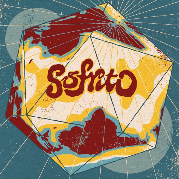
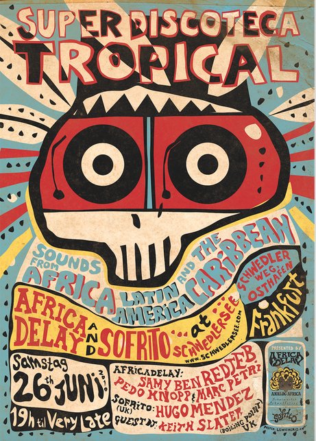
In the case of Sofrito, Hugo and Frankie have been instrumental in deciding which direction we go in, but my style has directed the aesthetic from day one, so I’m very proud of that. Since it started as a club night, the posters – which I had a lot of creative freedom over – laid the foundations for the look. In that sense, Sofrito is unique in my portfolio.
What do you think are the main reasons and motivations your art is perfectly capable of reflecting the spirit of the reissues of music from 60’s and 70’s?
Well I’m not sure exactly, to be honest, but it must be partly because I grew up surrounded by record sleeves and book covers and general paraphernalia of the time, and absorbed that into my visual language. So when tasked with reflecting the design of mid-20th Century record sleeves, I get what the original designers were doing and find it easy to reflect the style and apply it to my own concepts. It’s a mix of studying, copying, and adding to it. I always try to go beyond simply aping it, because that’s how ‘retro’ becomes a style. It’s fakery. I really don’t want it to be retro, I want it to feel classic while still being fresh in some way. I guess I’m always trying to work within a tradition, and to be in a dialogue with it. It’s a mysterious balancing act at times.
I’m sure that the process varies each and every time, but in average, how much time do you spend with listening the album before you actually start working on an idea for the cover? Do you need to build a bond with the songs in order to make a cover for a record?
Yes, I absolutely have to build a bond with it; to get inside it. Not necessarily before I begin, but certainly in the early stages. I spend less time listening beforehand now than I used to, just because I feel more accustomed to the music that comes my way than I did when it was all revelatory. So now it’s a case of working out what sets it apart from the other music I already know, and making sure that’s somehow worked into the design. I try to get into the space of the music and musicians as much as is possible without actually being them – I’ll know the basslines, the interactions between the horns and the strings, and be able to start singing the next track in the right key before it starts. I just wish I spoke all the languages!
Depending on the project, I might approach it in an abstract way and start making shapes and colours as I listen and see how they interact. With other projects, I might spend a lot of time writing first, then sketching concepts from what I’ve written, then only start thinking about the actual look of it once the concept is solid (and agreed). At every stage I concentrate on the task of providing a window onto the universe of the music contained within, so I will only ever listen to the music while working on it, nothing else. If, as I look at it, it feels like there’s a conversation happening between the sound and the visual, I keep working in that direction. Then it’s just a case of knowing when to stop…
What kind of other aspects of a record interest you while working on a cover? What kind of researches do you usually find necessary especially while working with reissues?
Reissues (or more specifically, compilations, since reissues quite often use the original artwork) are a very specific challenge. If only I could travel back to the time and place where the records were recorded, and be able to smell the food they were eating in between takes, or touch the walls, or inspect their instruments. Instead I just have to do the best I can at achieving that by Google, or if I’m lucky, photos and collections belonging the reissue/compilation compilers or surviving musicians. It’s often a horribly third-hand process, but we do have more in the way of time-travel simulation than any other generation before us thanks to the internet. Anything could spark a direction, but you won’t get anything satisfactory unless you dig deep for a while, and even then I have to accept that I’m not someone who’s part of the original production. I’m doing a specific, and very different job: I’m helping extend the distribution of this music to a wider audience than it was originally sold to, often one populated by listeners who have no idea what to expect. This isn’t something designers contemporary to the music normally have to worry about. They just make a cover as good as they can, and agree with the band or label on what it’ll look like. I can’t speak with the original musicians since most of the time they’re gone, and on a compilation you’d have to find an agreement between a hundred or so musicians. So the issue of representation becomes central to the task, and it’s a very difficult one to wrestle with. You mustn’t rely on clichés or tropes, or you’ll misrepresent the musicians. You need to approach it with the respect and excitement you approach any current band cover, while always thinking about how the new audience will read it. It’s a sort of manufactured synaesthesia – at best you’re trying to make the music play in the mind of a passerby, who’s never heard the music before. At the very least, you want them to pick it up and think, yeah I’ll take a punt on that. The process that gets a cover to that point is one of careful construction, with the hope that somewhere within it something will happen that’ll be mysterious even to you. To get there, I have to get lost. I can’t be sat in a room in London. It sounds cheesy as hell but the music is ultimately the mode of transport.

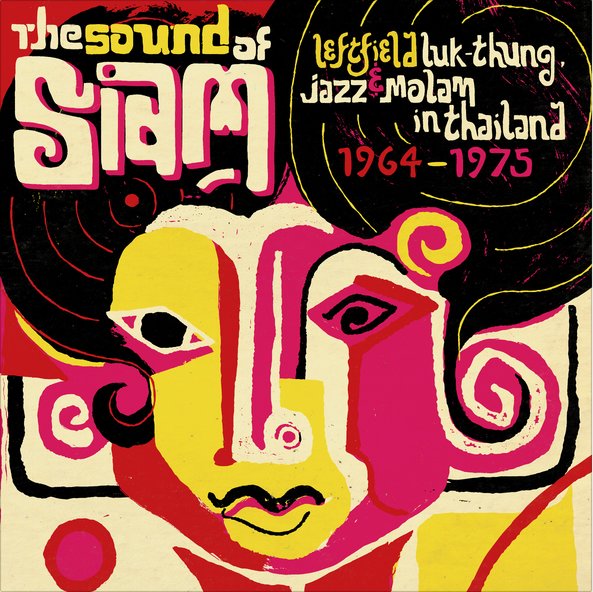
When you put DrumTalk’s The Airbourne EP and Soundway’s The Sound Of Siam compilation next to each other, they might seem like they belong to two different artists. What are the main aspects that reveal your own perspective during the creation process of a record cover?
I’m really glad you said that! Because they’re radically different records. They should look different. I’m always a bit disappointed when people look at my record sleeves and say, oh yeah, you’ve got a really particular style. Obviously I want it to make sense that I’ve been involved with it, but my aim isn’t to do a Lewis Heriz cover. It’s to do a good cover; i.e. one that communicates the music as best as possible. As I said before, I try not to impose my own perspective too much, because you’ll always reveal yourself in the marks you make no matter what you do, so let it go, just concentrate on representing the record.
You’re also a record collector as far as I know. I assume that you sometimes just go with the covers when you’re digging records. When was the last time you made a choice like that and which album was that?
Ha, that’s a great question – I did it to some degree with all the records I bought on a recent trip to LA & SF actually, as I don’t have a portable. The last one I bought that way was ‘This Is The Beginning’ by Leon’s Creation. It’s helpful when you can actually see the band, as their personal style says quite a lot, and you can just tell these guys had the chops from looking at them… the dress & look of the members spans from cosmic afrofuturism (they included a drawn ankh hieroglyph on the front which added to that reference) to early 70s psych/soul, so whatever the actual music was I knew it’d be somewhere in that realm. But more than anything I just loved the rawness of the hand-illustrated lettering. Any cover that has drawn bits that look like they were done by one of the band members is always worth a listen – I don’t know why, really, but I guess it adds to the connection between the cover and the musicians, so helps make it feel like an authentic artistic expression.
So far you’ve made lots of designs for gig posters, album and book covers. Also you’ve done an amazing labelling for Howling Hops beer. Do you have any format or size of work that you’d love to give a try for the first time?
Yes, I really want to go big. Walls, or at the very least large canvasses. I’ve not had the chance yet, mainly because I’ve been constrained to a relatively cramped studio, and I really have a hankering for playing with space and colour on a grand scale. You look at large-scale works and they have a completely different effect on you, you get taken in. That’s why I think it’s useless to pass judgement on artists when you’ve only seen small-scale reproductions of the work. You think Rothko’s rubbish, but you’ve never stood in front of one? Shhh now, you know nothing. To be able to fill your vision with fields of colour would be a real joy. Soon, I hope!
Your parents were into music and arts, so you had the chance to spend your childhood with lots of records around you. What are the first highlights from your first connections with this culture? What was the first record cover that engaged your attention?
Really early on, I used to put on a record and just sit and watch the label go round and round as I listened, mesmerised, like a cat gets hypnotised by a washing machine. For hours on end, record after record, amazed by it. As well as the usual Teddy Bear’s Picnic and Disney soundtracks, Beatles & Beach Boys, on repeat were the Bonzo Dog Band, Ivor Cutler, Talking Heads, Ian Dury, loads of blues. I remember jumping around the living room as a 5 or 6 year-old to X-Ray Spex’s ‘Identity’ 45 on pink vinyl. The combination of Poly Styrene’s voice and that record colour made me go hyper, like it was packed with E-numbers… As for the first record cover that engaged my attention, it would probably be the Bonzo’s Gorilla LP, in all honesty. Anything that made me laugh I liked. I found that record hilarious; not just the front cover, but the sleeve notes too – a complete spoof of the conventions. ‘This record’s dedicated to Kong, who must’ve been a great bloke’. Then you look back at the front, and it’s a massive bloke in a gorilla suit. So stupid. Perfect stuff for kids… But on another level it was the way the artwork felt anarchic and parodic, exactly like the music, that made me feel more of a connection with it, like I understood where they were coming from better than I could if I’d just heard the music alone. That’s what a cover should do, and as art school graduates they could do it themselves. They got it.
London is a city that brilliantly combines a lot of different cultures and perspectives. As an artist who’s working with musicians and bands from all over the world, what’s the role of London in your artistic journey?
Well I wouldn’t have done any of this work without London. Before I moved here, I was already working with Hugo Mendez and Frankie Francis on the embryonic Sofrito, which has always been as London as you can get. East London in particular. Sofrito would not have existed without that uniquely rich cultural mix provided by it, and we’ve always said that it was born out of the city’s club scene: from its reggae soundsystems & MCs; musicians from across Africa, the Caribbean and Latin America performing and recording here; the UK garage scene that Hugo started out in feeding into the dancefloor ethos of it… it couldn’t have happened anywhere else. Thanks to venues like Cafe OTO I’ve been able to see the Sun Ra Arkestra, Ndagga Rhythm Force, Hailu Mergia, and Idris Ackamoor & the Pyramids play up-close, take photos of them playing as research for my sleeves for them. The Heliocentrics’ studio is practically next door, and I’ll bump into members of Family Atlantica while walking to the shop. You feel that global influence everywhere in what is essentially hundreds of linked-up villages. As for my non-music work, when it’s not directly leading on from the LPs & posters, I could be anywhere… but London’s population will never cease to be interesting. It was why I enjoyed drawing people on the tube or on the bus so much (I cycle everywhere now, so can’t unfortunately, without staring death in the face): this infinite variety.
What’s next for Lewis Heriz? Can you give us some clues about your upcoming projects?
As well as continuing work with Soundway, and Hugo Mendez, on the music side, I’m in the final stages of creating the illustrations for Open City Documentary Festival, which’ll be happening over 5 days this August. I’m still working with Howling Hops regularly, and a new independent roastery in Dubai’s arts quarter – Nightjar Coffee. But I’m managing to do more personal work now, and hope to increase the writing and cartooning I used to do before the music work took off a decade ago. I’m also doing more screen printing again, and I’m trying to fit in some animation, too, wherever I can. I like to keep my options open.