The visual facilitator: Chris Bilheimer
“Sometimes I feel like I can bridge the gap between the fringe and the mainstream.”
Interview by Leyla Aksu
Coming out of Athens, Georgia, designer Chris Bilheimer is sort of a quiet master of the music world and the name behind some of the most iconic rock album covers to date. The in-house art director for R.E.M., Bilheimer also worked with bands like Green Day, Neutral Milk Hotel, and Weezer, and may just be the owner of the net’s most facetious web site. Bilheimer also recently brought together the poster for Alamo Drafthouse’s genre film festival in Austin, Fantastic Fest, and its program of Turkish Delights. Having delved into the world of the heroes and monsters of Turkish cinema, Bilheimer talked to us about his career, feelings towards music, and how the poster came to be.
Can you tell us a bit about how and when you first started drawing? When did things start to take a more professional turn?
I started drawing as a child, like most children. It was probably around age 9 that people began to notice that it was something I was good at and was really fun. I was not a very good student, but I had no problem working really hard at drawing. The evolution into a profession was a very gradual process. I started out drawing t-shirt designs for friends, and making flyers for bands. I always wanted to be a musician, but I do not have the ability, so making flyers and backdrops and t-shirts was my way of being involved in the music world.
Your work is a part of the visual impact of so much in music. What’s your own relationship to music like and how has that changed over the years?
As I have gotten older, I find it is harder to keep up with all the new bands. The internet has only made that harder. Technology has made it so easy for people to have the resources to make and distribute an album. Those were things that used to be prohibitively expensive, but are now accessible to nearly everyone, which I think is a great thing, but it does make it harder to keep track of it all. My current attitude towards music is just wanting to hear something new, that I haven’t heard over and over. It is more about just enjoying it in the moment and not needing to collect every track and find out all their influences and buy those albums too. I guess it’s called getting old!
You started working with R.E.M. back in 1994, and were initially only hired for a year, right? How did you guys meet and what was that first year like?
I met Michael Stipe in 1989 through a mutual friend in town, (Athens is a pretty small town) and we got along really well. Over the years I would help him with various visual projects. I did stage lighting for a few tiny R.E.M. shows at local clubs, designed covers for bands that he produced, and helped him with small aspects of Out of Time and Automatic For The People. I had learned how to do layout on computers early on and just started helping Michael more and more. By the time they were ready to start Monster and go on a yearlong tour, they figured Michael needed more help with the art stuff, which he was overseeing. That first year was pretty interesting. I was 23 and had never worked on anything of that size before in my life. I had some very gracious people teach me along the way.
R.E.M. always had the view that ideas were more important that experience. You didn’t need to go to school or have work experience, as long as you had good ideas and could realize them. That was a really important lesson for me, and it is something I have always tried to pass on to others.
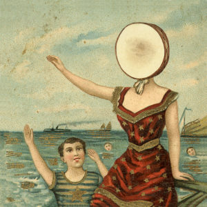
Can you tell us a bit about working on Neutral Milk Hotel’s In the Aeroplane Over the Sea? How did that artwork come together and, as a touchstone album in indie music, how do you feel about that piece today?
The guys in NMH lived just down the street from me. I actually briefly lived in the house that they were renting. I started helping with a bunch of the Elephant 6 bands because we all knew each other from around town and I felt that it was really important to support the music community. I grew up in that community and out of that came a life-long career in graphic design, so I felt I owed it to them to give back. When I started working on Aeroplane, Jeff Mangum came to me with a whole bunch of different images that he wanted to use. My biggest challenge was to make them all fit together as a whole. The cover came from a vintage postcard that we altered. I scanned the backside of the postcard and used that paper texture on all the other elements as a way to make them seem that they came from the same time/place and it worked out really well.
You’ve mentioned a “timeless” quality in the pieces that you create. What exactly does that mean to you aesthetically?
I guess what I mean about “timeless” is that I try to avoid contemporary design trends or fads that would cause the project to look like it was created during a specific period. Sometimes certain styles or fonts can very quickly become dated and make you think “Oh, that was created in 2012” unless that is thematically relevant. I have no problem working in a certain era’s style if it makes sense with the project.
You’ve also described what you do as “helping other people express themselves.” How do you feel that role, as a sort of visual facilitator, has developed over the years? In the case of R.E.M. and Green Day, what is it like to get to work with a single band for such a long stretch of time?
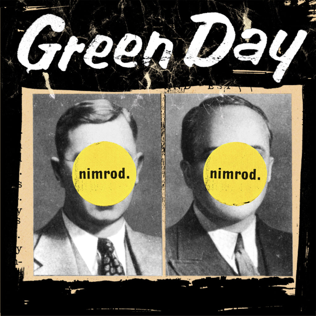
I don’t really feel like that role has changed much over the years at its core. I still see that as my job. The thing that has changed is the medium. Luckily there is still print and packaging, but the new digital landscape has created many more avenues that require a designer to translate the band’s voice into the new mediums. Getting to work with R.E.M. and Green day for so long is really great because you really get the time to learn the band’s image and voice. The more time you get to understand where they are coming from, the less time you spend going back and forth to get something right. After awhile, you almost don’t even need to discuss it anymore, if becomes second nature. I am really lucky to have been able to stay with both bands for so long.
Can you tell us about your recent show, “This Is Starting to Fade?” When did you first start taking Polaroids and what made you stick with it?
I have always taken Polaroids through college, but it wasn’t something I took seriously until after college in about 1994. My roommate was Lance Bangs, a great film/video director, and he started taking Polaroid portraits of people who visited our apartment. Instead of portraits, I started documenting more of my travels and just the things around me. I stuck with it mainly because it was super-fun and it was the only visual expression I had that completely my own, and not tied to someone else’s creative project or vision.
Are there any album covers or movie posters that have had a particular lasting impact on you? How do you see album art changing as things continue to get progressively digitized?
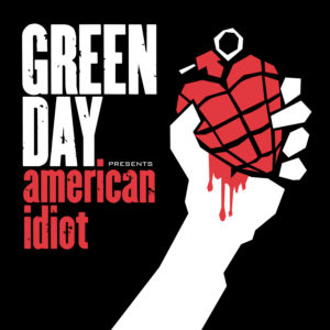
Honestly, there are a ton of both albums and posters that have had a lasting impression on me and I can’t really scratch the surface of them in any sort of easy way. The one easy one to point to is the work of Saul Bass. His work is some of my favorite design of all-time, and has directly influenced my work. American Idiot is a direct homage to Bass’ work and a great example of movies and music bleeding into each other.
You moved from Georgia to Austin a few years ago, another city with a strong local creative community. Is that important to you? What has working there been like?
Having a strong creative community is essential for me. There weren’t many designers in Athens, but that didn’t bother me. Just being around creative energy and people who are pushing themselves to create is inspiring, whether it is music, film, photography, woodworking, it doesn’t matter. Coming to Austin, I am surrounded by amazing designers, so it has been really fun to be immersed in a scene that has such direct and specific design experiences to share. It has been really great and very much responsible for the transition from music into film.
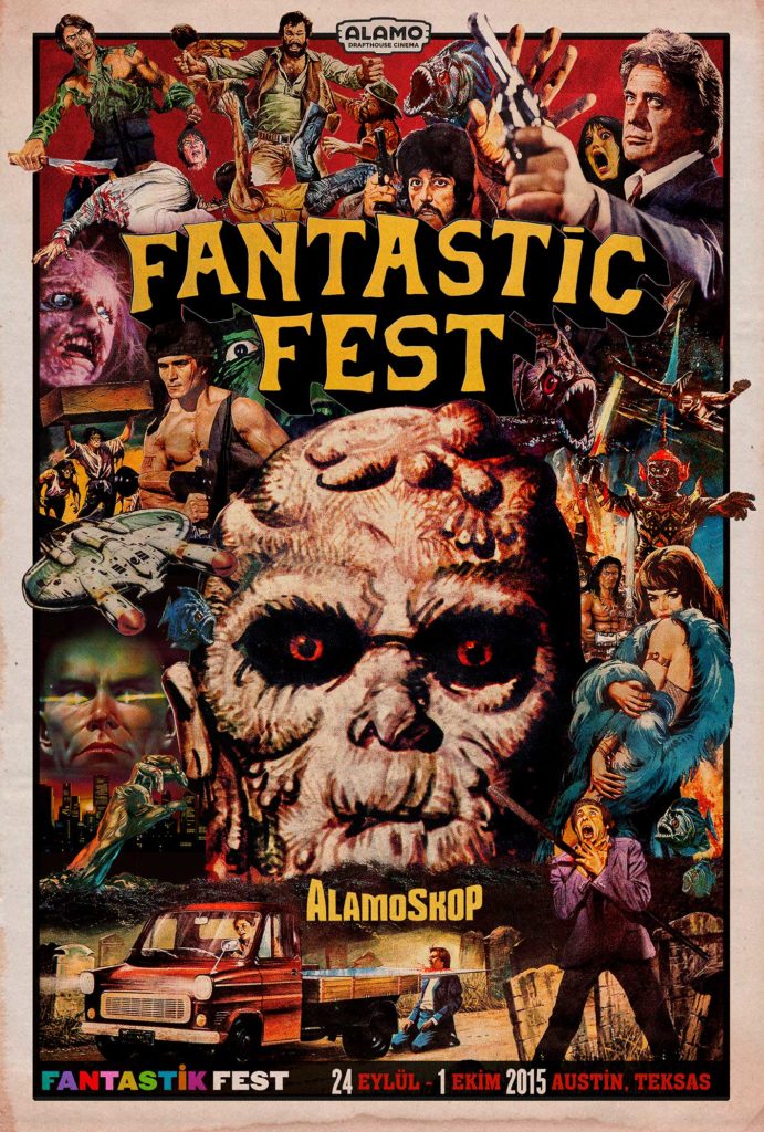
Getting to the Fantastic Fest poster, are you a fan of genre film?
I am going to tell you a secret. I do not know a lot about genre film. I have always had slightly broader taste in music and film than a lot of my peers. Most of my friends know WAY more about fringe films and music than I do, but there are two interesting things about that. The first is that I think my broader taste is actually an advantage in that I feel like I can (sometimes) bridge the gap between the fringe and the mainstream because I am a little bit on the mainstream side. I can see the elements in something that will appeal to a larger audience and focus on that element as the road into an area some people might otherwise be afraid to go.
The second is that it is important to me to be around people who are passionate about what they do. I don’t necessarily have to love a style of film if I am around someone who does. I can see their passion and tap into it and use it to make good work that honors the subject.
How did the festival get in touch with you and how did the visual idea come about? Were you familiar with Turkish genre film before then?
I took a job at the Alamo Drafthouse as head of design a few months ago. I oversee all of the design for the theaters as well as Drafthouse Films. Fantastic Fest falls under that as well. I hooked up with Alamo through some friends at Mondo. The original concept for the design for this year’s festival came from my co-worker Joe Ziemba. He and Alamo owner Tim League compiled a whole bunch of posters from Tim’s collection. I didn’t know much about it until Joe explained to me the history of unique illustration in the Turkish poster world. We quickly knew we wanted to focus on the elements from all these posters that were unique to Turkey and didn’t appear on the posters in other countries. It was Joe’s passion and deep knowledge that got me on the right path for this project, and goes to show what I mean about the importance of surrounding yourself with people that are passionate about what they do. It only took a few minutes of Joe explaining why he loves Turkish posters for me to get excited and inspired to really do justice to the Turkish history of amazing posters. I am super proud of the work and now share Joe’s love of unique Turkish design.