With Robert Garcia: On Virgil Finlay’s Expanding Legacy
“A truly unique presentation of the work of one of the geniuses of 20th Century illustration.”
Interview by Leyla Aksu
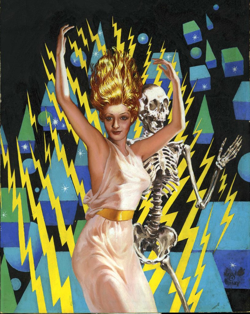
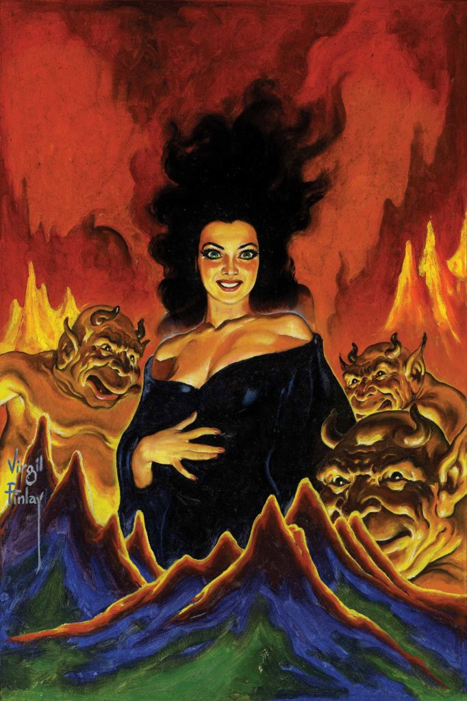
Virgil Finlay was, and continues to be one of the leading names, in American genre illustration. The dark thoughts, creepy monsters, seductive women, and unknown worlds that were released from his pen would not only bring their accompanying stories to life, but with their unusual elegance and detail demand attention as works in their own right. Prepared for American Fantasy Press to celebrate Finlay’s 100th year, The Collectors’ Book of Virgil Finlay brings together a rich collection of works that haven’t been seen together before. We talked to publisher Robert Garcia about the book’s preparation and Finlay’s artistic legacy.
When and where did you first come across Virgil Finlay’s work? What was it about his pieces that spoke to you?
I was introduced to Virgil Finlay’s work during a visit to the home of writer/art collector Robert Weinberg in the 1980’s. He had dozens of Finlay originals among his extensive art collection. I was captivated by the exquisite detail and incredible likenesses. Most of the art I had seen in the genre was very stylized. Finlay stood out like a beacon from the crowd. He obviously came from a much different tradition of illustration art. Much more realistic and representational. I fell in love with his work.
Finlay is responsible for what we would now consider iconic imagery in relation to genre illustration, such as sci-fi, fantasy, and horror. What about his style and expression do you think suits the field so well?
In Finlay’s pieces there is no doubt that everything in the illustration is clearly part of the subject’s world. The artist gives equal weight to the human subject(s) and the alien or fantastic elements of the illustration. Everything is detailed and realistically rendered.
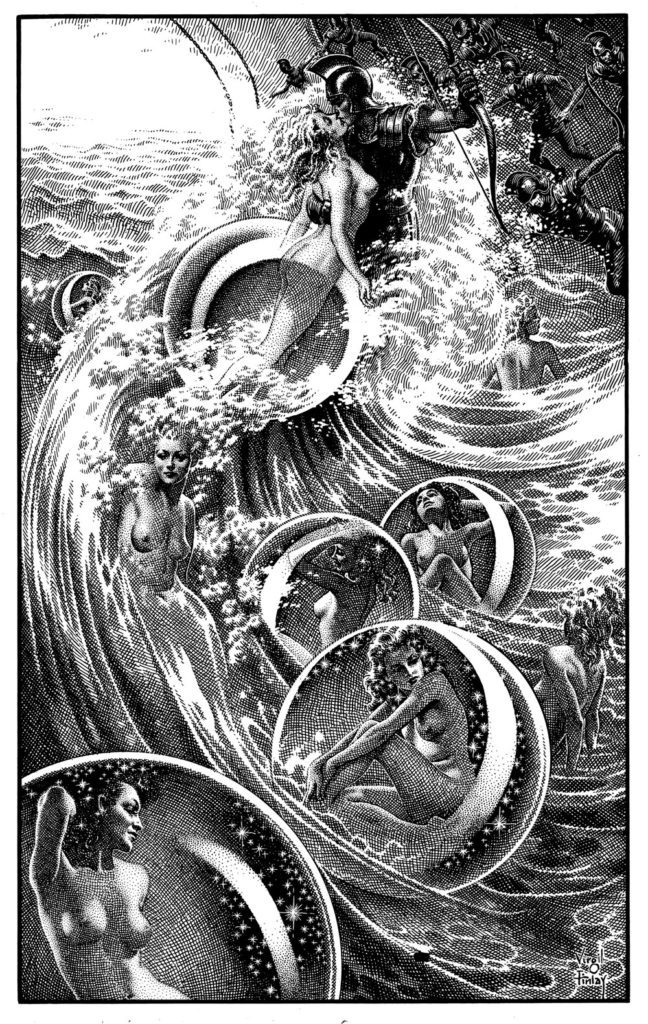
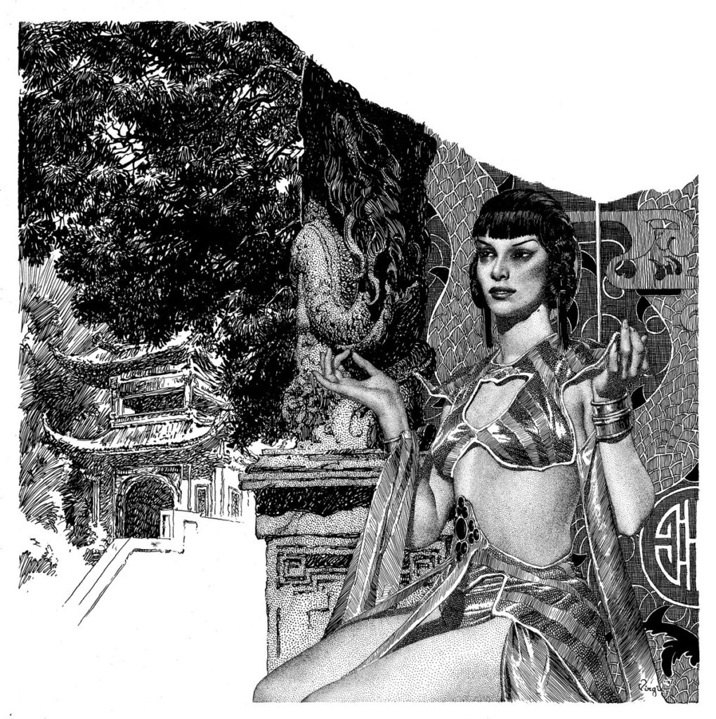
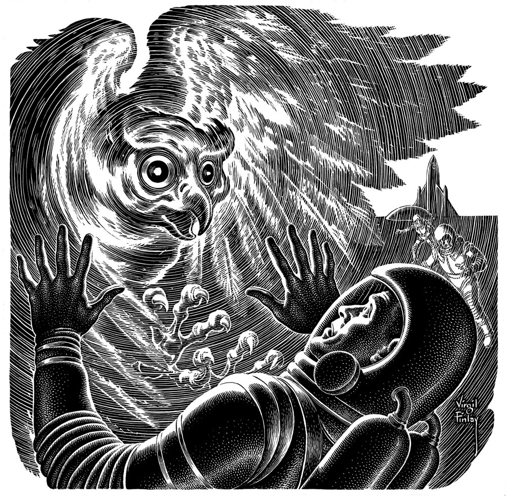
Finlay’s pieces are known for their detail and masterful use of texture and light. What can you tell us about Finlay’s techniques and what his style inspired?
He inspired a couple of generations of science fiction illustrators, from Laurence Stearne Stevens to Stephen Fabian to Janet Aulisio, among others. While they were inspired by his vision and compositions, they did not copy his technique. Finlay’s methods were very time-consuming, especially the stippling work. After each drop, he needed to clean his pen to keep the work uniform. There are hundreds of drops per stipple illustration. When he used scratchboard, he always added white or black ink to finish his image. So you have thin white lines overlapping black lines, and vice versa. If you look at the detail on his The Ship of Ishtar illustrations, you can see his outstanding skill. But it all takes time, and most illustrators have to make a living and don’t use such time-consuming techniques. Later in Finlay’s career, you’ll see that sometimes he resorted to coquille paper and ink washes as time savers. But Finlay had an astounding work ethic. It’s estimated he produced over 2,500 pieces during his career.
How did you all come together and what made you decide to prepare a Virgil Finlay collection?
Robert Weinberg and Douglas Ellis have two of the largest Virgil Finlay collections in the world. I’ve known both of the gentlemen for years. They knew of my design/publishing history and occasionally we had discussed putting together some version of this book. It was during Chicon 2012 that Michael Walsh, a co-chairman of the 2014 World Fantasy Convention, told me that Virgil’s daughter Lail was going to be a guest at their convention. There was to be a special program celebrating the 100th birthday of Virgil Finlay with an exhibition of original artwork, programming, and more. Hearing this, I talked to Doug and Bob, and we decided that this would be a perfect time to do the Finlay book as a specialty press project with a small press run and high quality production. I hadn’t known it, but the two of them had been talking about doing a similar book then as well. So it all came together. They asked collector Glynn Crain to include his collection of color paintings, and publisher/art collector Robert K. Wiener joined in to really fill out the book with a number of astrological illustrations from late in Finlay’s career, as well as beautiful color pieces. Then Bob, Doug, and I began working.
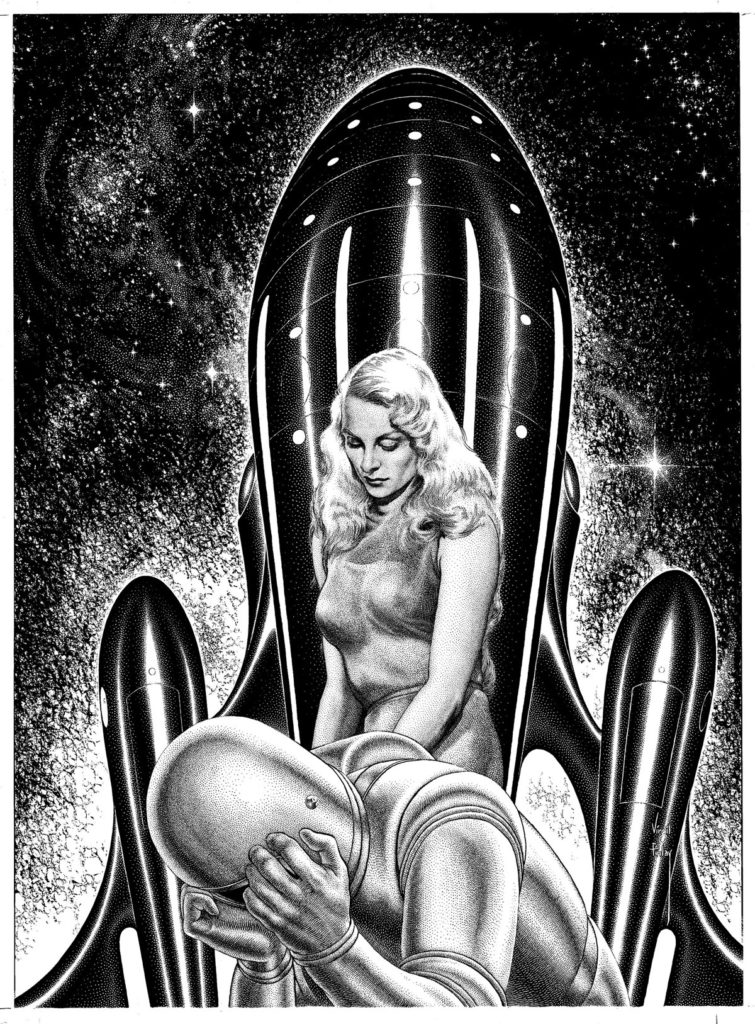
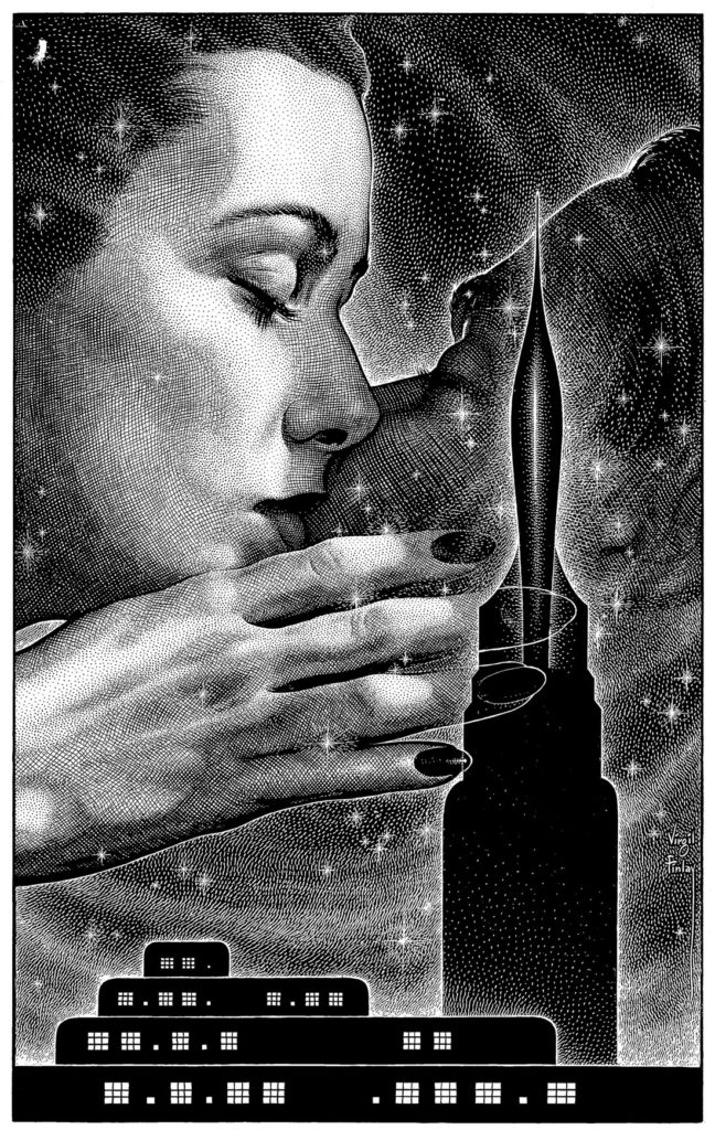
Can you tell us a bit about the process of preparing this book? How did you decide on what the collection would look like and, given Finlay’s breadth of work, what to include?
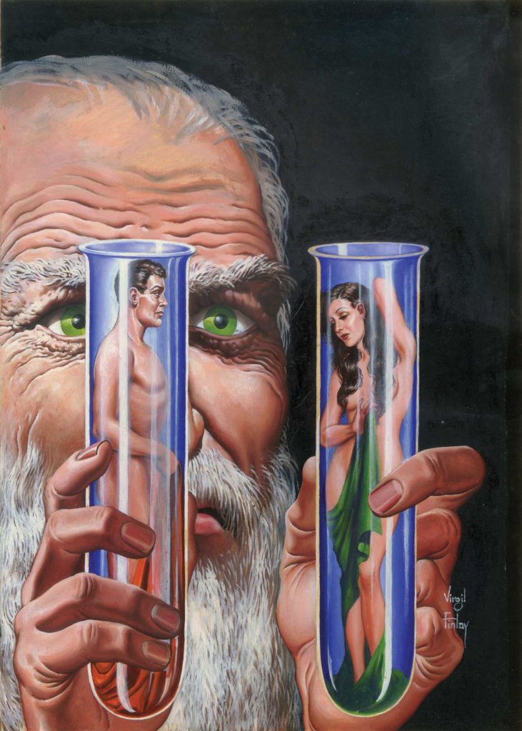
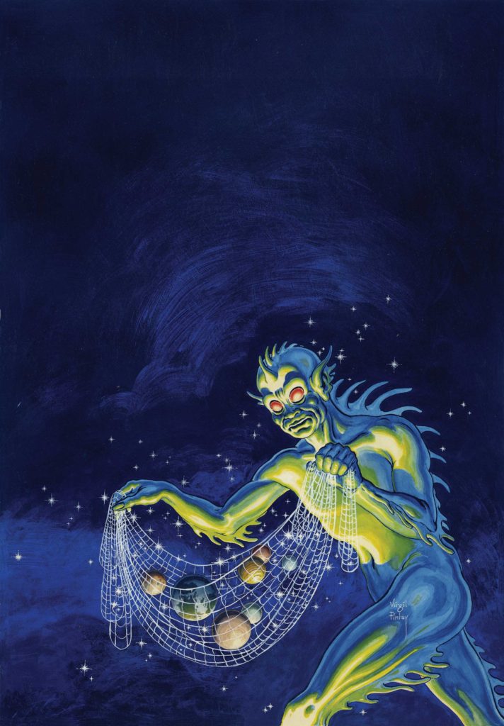
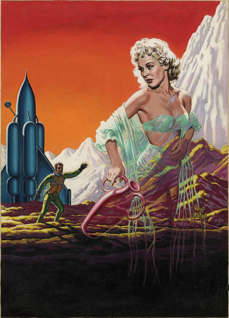
The selection process was easy. All the artwork came from the collections of Robert Weinberg, Douglas Ellis, Glynn Crain, and Robert K. Wiener, and we used every piece they had at the time. Luckily those collections complemented each other and gave us everything we needed in terms of technique: pencil roughs, ink roughs, color comps, early paintings, scratchboard pieces, stippled pen work, washes, coquille paper, two-color work for the Science Fiction Book Club and many final cover paintings (used and unused). The subjects were broad and fascinating. We were also able to reproduce a few of Finlay’s iconic pieces like his portrait of H.P. Lovecraft, all five B&W illustrations for Merritt’s The Ship of Ishtar, a few rare pieces from The American Weekly (where he worked as a staff artist), his first cover for Weird Tales, and other key works.
There have been a few collections of Finlay’s work published before. What separates this from the previous ones?
This book has a few things that make it stand out from previous collections.
1) The book itself is 9” x 12” and produced at a printer noted for its quality books for museums and art galleries all along the East Coast. As far as I know, nothing of this print production quality has ever been done in the field.
2) Scanning technology has advanced to the point where we can flatscan all the artwork with the same fidelity we used to have to go to drum scanners to achieve. We scanned the line art at 2400 dpi, ensuring the best reproduction of his art. Today’s scanners can bypass the tricky exposure problems that copy cameras ran into when shooting his work in the past. The lines don’t fill in when trying to accommodate the black areas of the artwork, and we get a much cleaner and truer reproduction than ever before. Since Finlay sometimes did not have scratchboard to use, he turned to paper that has since yellowed or browned with age. We’re now able to compensate for that pretty easily with Photoshop.
3) We have 58 pieces of color artwork in this book, which is the largest gathering of Finlay color work ever published.
What can you tell us about the book’s cover? How and why was it chosen?
Since Finlay is famous for his beautiful women, I knew we’d have to have one on the cover. Since we’d be using a stamping for the cover, his stipple portraits of women would not work. So I turned to his scratchboard work and saw this piece for Edison Marshall’s “Dian of the Lost Land.” The girl in the illustration had a stunning profile, and her arms were positioned as if she was yearningly reaching for the stars. To me, she was the embodiment of Finlay’s embrace of the wonder of the universe. I knew I had found the cover art. Later, his daughter Lail told me that she had been the model for the girl. I just had to smile. It was perfect.
Unusually, Finlay would draw his images to size for magazines. Did this present any challenges or opportunities?
The fun part of this book was that we decided to showcase the absolute brilliance and skill of Finlay by running as many pieces as we could in the book at original size. We did not expand any artwork to fill the page, as had been done in every other Finlay book. It’s in this way that the book is truly a unique presentation of the work of one of the geniuses of 20th Century illustration.
The Kickstarter campaign for the collection received a lot of attention and support. How has the response been since the release of the book?
The Kickstarter was a wonderful help in launching this book. The funds came nowhere near covering the final production costs, but we hadn’t planned on it doing so. But it gave us over 150 supporters. The campaign generated a huge amount of publicity and we couldn’t have done the book without the attention and support it provided.
The response to the book has been overwhelmingly positive. The folks, who have purchased it, love it. (There are only a few copies left from www.americanfantasypress.com if you want one.) The only trouble now is figuring out a follow-up book, but we have several projects in mind. I am currently designing a book about another pulp artist, currently entitled The Art of Jon Arfstrom for DreamHaven Books.
Finally, how would you describe the place of Finlay’s work within the context of genre art and the art world at large in the present day?
Virgil Finlay was the best illustrator of science fiction, fantasy, and horror art of the 20th Century. His legacy as such will stand unchallenged. As Robert Weinberg wrote in his introduction to the book: “Finlay wasn’t merely great. He was the greatest. His heroines were the most beautiful; his heroes were the most heroic; and his monsters and villains were the most frightening. Always. He was the best.”
Beyond the genre, I believe his reputation will only grow. Just this year, he was entered into the Society of Illustrators’ Hall of Fame. Who knows what the future will bring?
